Carsten Wolff
Willy Fleckhaus and the coolly calculated intoxication of colors
School of Art
Willy Fleckhaus (1925–1983) features alongside Otl Aicher and Anton Stankowski as one of the defining figures in German graphic design in the second half of the 20th century. After his death, his work was rapidly dispersed. Since the early 1990s, intensive research work and targeted collecting has led to the formation of a unique archive of Fleckhaus’s body of work in Frankfurt/Main, accompanied by regular publications and exhibitions. In this way, his status in the history of design has been asserted and his work also made known to a wider audience. The research project addresses various questions, including the following:
DESIGN HISTORY. It is undisputed that Fleckhaus is one of the most important and influential figures in German design history. But what distinguishes him from other important protagonists of German and Swiss graphic design, such as Otl Aicher, Anton Stankowski, Josef Müller-Brockmann, Emil Ruder, etc.? What is the role and significance of Fleckhaus in German-language graphic design during the period from 1950 to 1985? Where are there parallels and where contrasts with other great designers of the German-language graphic design scene? Where does Fleckhaus follow similar paths to his colleagues and where is he unique? How did Fleckhaus organize his work? What was the structure of his office and what were those of his colleagues? What did he adopt from Swiss design and what from the Americans? Outstanding design personalities have hitherto been regarded primarily in isolation in design-historical accounts. What additional insights are offered by direct comparison of the works and the comparison of the design principles of their creators?
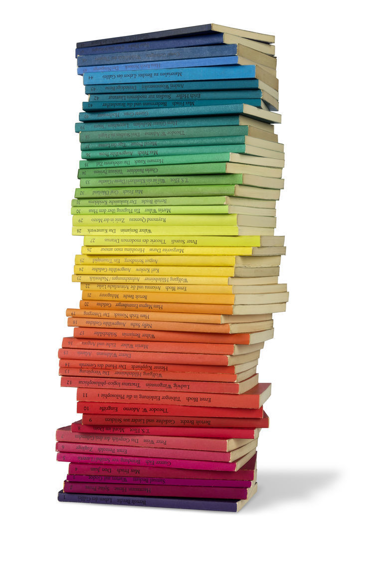
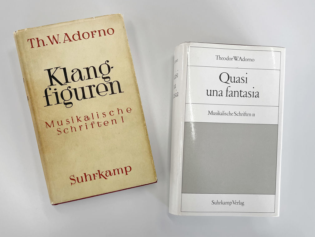
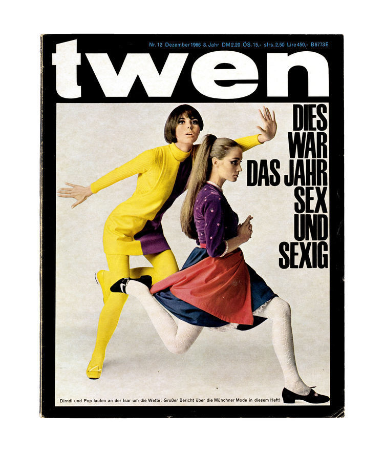
SERIALITY. Art director Willy Fleckhaus was one of the first designers to realize strictly serial graphic concepts. Milestones were the Bibliothek Suhrkamp series (from 1959), the edition suhrkamp series (from 1963), twen (1959–71), and later on Frankfurter Allgemeine Magazin (from 1980), which were characterized by formal, partly minimalist elements and yet always radiated a great sensuality. Part of the research will address where there were parallels with the art of the post-War period that could have influenced Fleckhaus’s design, and where designers in the German-speaking world dealt with similar concepts.
THE GRID. Fleckhaus became familiar with the design grid at the latest during his visit to Max Bill at the Hochschule für Gestaltung in Ulm in the mid-1950s. He often used the layout grid as an efficient tool to simplify day-to-day layout work, but occasionally also pushed it to its limits and indeed surpassed them to enhance the effect of double-page spreads, font design, or a series of images. Does the design of the media for which he did the layout enable us to identify the point in time from which he began working with the grid? Which screens are identifiable in which media and how are they applied? What development in grid application can be discerned in his work between the 1950s and 1980s? How do other outstanding design figures of his time use the grid?
DESIGNING MODERNISM – THINKING MODERNISM. During the polarizing late 1960s and early 1970s, the edition suhrkamp series became “the proverbial bi-program of student unrest”[1]; it was considered a “sounding board for the Frankfurt school”[2]. Writer Klaus Horn commented on the phone call he received, asking him for a manuscript for edition suhrkamp, as follows: “My heartbeat was pounding right into the earpiece of the telephone. I was to write something for the edition, to have already written it! That’s where the books were published that were written and read by the New Left that was coming into its own. [… ]In terms of content, but also in its form, this series signaled hope, a breakthrough.”[3] Modern thinking and modern aesthetics evidently entered into an almost ideal alliance in the edition. Does this paperback series, and perhaps also other series published by Suhrkamp, enable us to identify an influence of form on the attitude of the authors publishing in it and an effect on the texts published there?
TECHNIQUE. Fleckhaus’s characteristic style would have been unthinkable without phototypesetting. His closely-set typefaces, the sometimes complete lack of spacing between lines, and the merging of letters to form word pictures were possible only thanks to this new technological innovation. The rainbow colors of the edition suhrkamp series were based entirely on the printing color fan recently released by the firm Hostmann. What technical processes did he apply in his design and realization and what new creative possibilities did the new techniques open up for him?
ARCHIVE. Collecting, preserving, evaluating. These, roughly speaking, are the tasks of an archive in the traditional sense. Yet with the all-encompassing wave of digitization at the latest, the self-perception of an archive has also begun to change. What are the advantages of presenting the works by Willy Fleckhaus in a web archive over classic archives or presentation in print publications or exhibitions? How can the resonance of his work, which often still applies today, be linked up with the current discourse on design? How can the sensation that accompanied many of Fleckhaus’s works when they first appeared be brought back to life for laypersons and experts alike? How can the traditional notion of an archive be expanded to make the quality and exceptionality of these works (inter)actively perceptible to users? Which criteria apply to the evaluation of Fleckhaus’s work? Where is the archive’s claim rooted in spatial and temporal terms? Is it only of value retrospectively or can it play an active role in the present and for the future of design, too?
The research project develops the concept of a comprehensive archive on Germany’s first Art Director, presents the history of of Fleckhaus design in the realization of style-defining works, and assembles and demonstrates the necessary technical, aesthetic, social, and intellectual basis for this fundamental rejuvenation of advertising art after the Second World War.
Supervisors:
- Prof. Dr. Marc Ries
- Prof. Heiner Blum
[1] Arnd Rühle: “Literatur unterm Regenbogen,” in: Frankfurter Allgemeine Zeitung, August 14, 1993.
[2] Ibid.
[3] See Hans-Martin Lohmann: “Machen Sie weiter, noch lange!,” in: Der Autor, der nicht schreibt, (Frankfurt, 1989), p. 162.
Caption: See website
VITA
Carsten Wolff
Vita
—
*6. März 1970, Esslingen am Neckar
lebt in Frankfurt am Main
seit 2020 Doktorand an der HfG Offenbach mit dem Thema „Willy Fleckhaus und der kühl kalkulierte Rausch der Farben“ (Fachbereich Kunst)
2014 Erwerb und Umbau einer Büroetage mit 550qm im Frankfurter Ostend. Seither Sitz von FINE GERMAN DESIGN, der FINE GERMAN GALLERY, des Fleckhaus Archivs und des Co-Working Space FINE GERMAN SPACES, der Arbeitsräume und Arbeitsplätze für Gestalter anderer Disziplinen bereit hält (Architektur, Fotografie, Film)
2013 Geburt des Sohnes Leonard Benedikt
2006/07 Gastdozentur Fachhochschule Schwäbisch Hall – Hochschule für Gestaltung
2000 Geburt des Sohnes Paul-Henri Wolff
2006 Gründung der FINE GERMAN GALLERY mit Prof. Dr. Andras Bee, Berlin
1997 Gründung des bis heute geführten Designbüros FINE GERMAN DESIGN in Frankfurt am Main
1995 Abschluss als Diplom-Designer
1994 Ausfall des vereinbarten Praktikums bei Alan Chan Design, Hong Kong; als Ersatz fünfmonatiges Praktikum, Bates Worldwide, Frankfurt am Main
1993 Fünfmonatiges Praktikum beim Designhistoriker Prof. Eckhard Neumann, Frankfurt am Main
1991 Aufnahme des Studiums an der Hochschule für Gestaltung, Mannheim
1991 Sechsmonatiges Praktikum im Automobildesign, Mercedes Benz AG, Böblingen
Langjährige Kunden, mit denen ich eine intensive Zusammenarbeit in Print und Digital pflege oder pflegte:
Württembergische Landesbibliothek Stuttgart
Senckenberg Gesellschaft für Naturforschung mit 11 angeschlossenen Forschungsinstituten und drei Museen
Staatliche Kunsthalle Karlsruhe
Volksbühne im Großen Hirschgraben (zuvor Fliegende Volksbühne)
Bundesministerium der Finanzen, Berlin
Hessische Kulturstiftung, Wiesbaden
Frankfurt Airport
Fraport AG, Frankfurt am Main
MMK Museum für Moderne Kunst, Frankfurt am Main
PUBLIKATIONEN
Publikationen
in Auswahl
—
Wolff, Carsten: Alphawölfe. Die Gestalter Otl Aicher, Willy Fleckhaus, Anton Stankowski und Kurt Weidemann. Zum 100. Geburtstag von Otl Aicher, auf https://www.otlaicher.de/beitraege/alphawoelfe/
Wolff, Carsten: Tonangebend. Über das Design der Schallplattenhüllen von Willy Fleckhaus für das Magazin twen. Katalog zur Ausstellung: CoverArt (2.7.—16.10.22), Galerie Stihl, Waiblingen
Wolff, Carsten: Der kühl kalkulierte Rausch der Farben. Das Design der edition suhrkamp von Willy Fleckhaus. Berlin 2021 (Katalog zur Ausstellung Deutsches Design 1949–1989. Zwei Länder, eine Geschichte im Vitra Museum, Weil am Rhein. Danach im Kunstgewerbemuseum, Staatliche Kunstsammlungen Dresden )
Wolff, Carsten: Iris Musolf. Gravitation. Berlin 2018
Wolff, Carsten: Peter Sauerer. Null und Eins. Walleshausen 2017
Wolff, Carsten: Der Raster. The Grid. Frankfurt 2017
Wolff, Carsten / Koetzle, Hans-Michael (Hrsg.): Fleckhaus. Design, Revolte, Regenbogen. Design, Revolt, Rainbow. Hartmann Books, Stuttgart 2017
Wolff, Carsten / Koetzle, Hans-Michael (Hrsg.): Fleckhaus. Design, Revolte, Regenbogen. Design, Revolt, Rainbow. [Ausstellungskatalog zur gleichnamigen Ausstellung im Museum für Angewandte Kunst Köln] Köln 2016
Bee, Andreas / Kittelmann, Udo / Wolff, Carsten (Hrsg.): Knut. Die Heimat des Eisbären. Walther König, Köln 2007
Wolff, Carsten: Hans Hillmann. A Criminal Drawer. In: design report, Nr. 1, 1999, S. 10–15
Wolff, Carsten/Koetzle, Hans-Michael (Hrsg.): Fleckhaus. Deutschlands erster Art Director. Klinkhardt & Biermann, München/Berlin 1997
Wolff, Carsten: Fleckhaus. »Das Foto so groß und unbeeinflußt wie möglich«. In: Leica World, Nr. 2, 1997, S. 14–23
Wolff, Carsten: Das Schöne mit den einfachsten Mitteln. Willy Fleckhaus als Gestalter. In: Koetzle, Hans-Michael (Hrsg.): twen. Revision einer Legende. Stadtmuseum München, München 1995, S. 210–225
Kritiken von Fotoausstellungen in Photonews, Hamburg 1988–90
AUSZEICHNUNGEN
AUSZEICHNUNGEN
in Auswahl
—
2020 FINE GERMAN DESIGN ist Leading Experts in Cultural Branding
2022 FINE GERMAN DESIGN ist Best Cultural Branding Design Agency
German Brand Award (Rat für Formgebung)
2019 · Corporate Design, Frankfurt Airport
Agfa Newcomer-WettbewerB
1992 · 3. Platz bei 2000 Einreichungen
Art Directors Club
2007 · Martin Liebscher, A Man with Opportunities, Galerie Voges & Partner
DDC Deutscher Designer Club
2007 · Das Kapital. Blue Chips & Masterpieces, MMK Museum für Moderne Kunst Frankfurt am Main
2007 · Knut. Die Heimat des Eisbären, Verlag der Buchhandlung Walther König, Köln
2007 · Bronze · Martin Liebscher. A Man with Opportunities, Galerie Voges + Partner, Frankfurt am Main
2005 · Bronze · New York Vertical Infinity, Edition Panorama, Mannheim
2005 · Spinnwebzeit - Die eBay-Vernetzung, MMK Museum für Moderne Kunst Frankfurt am Main
2004 · Edition Panorama Bibliothek, Edition Panorama, Mannheim
2004 · Bronze · Homepage MMK Museum für Moderne Kunst Frankfurt am Main
European Design Award
2017 · Willy Fleckhaus. Design, Revolte, Regenbogen (Finalist 2017)
German Design Award
2015 · Literaturm, Kulturamt Frankfurt am Main
2012 · Jack Goldstein Katalog, MMK Museum für Moderne Kunst Frankfurt am Main
German Design Award (Nominierungen)
2009 · Das Kapital. Blue Chips & Masterpieces, MMK Museum für Moderne Kunst Frankfurt am Main
2009 · Martin Liebscher. A Man with Opportunities, Galerie Voges + Partner, Frankfurt am Main
2009 · Knut. Die Heimat des Eisbären, Verlag der Buchhandlung Walther König, Köln
2008 · Martin Liebscher, A Man with Opportunities, Galerie Voges & Partner, Frankfurt am Main
2008 · Spinnwebzeit. Die e-Bay-Vernetzung, MMK Museum für Moderne Kunst Frankfurt am Main
2008 · www.wolff-kommunikation.de
2007 · Edition Panorama Bibliothek
2007 · What’s new Pussycat?, MMK Museum für Moderne Kunst Frankfurt am Main
2007 · Alpen 2005, Edition Panorama, Mannheim
2007 · www.editionpanorama.de
Gregor International Calendar Award
2006 · Trees Bäume, Edition Panorama, Mannheim
2006 · Alpen Panorama, Edition Panorama, Mannheim
2006 · Flowers 2006, Edition Panorama, Mannheim
2006 · Bronze · Trees/Bäume, Edition Panorama, Mannheim
2005 · Venezia 2005, Edition Panorama, Mannheim
2004 · Silber · Nature 2004, Edition Panorama, Mannheim
iF communication design award
2010 · Gold · Martin Liebscher. Einer für alle. One for all. Hatje Cantz, Stuttgart
2010 · Jack Goldstein Katalog, MMK Museum für Moderne Kunst Frankfurt am Main
2007 · Martin Liebscher – Ein Mann mit Eigenschaften, Galerie Voges + Partner, Frankfurt am Main
2007 · Das Kapital – Blue Chips & Masterpieces, MMK Museum für Moderne Kunst Frankfurt am Main
2007 · Martin Liebscher – Ein Mann mit Eigenschaften, Galerie Voges + Partner, Frankfurt am Main
2007 · maecenas Newsletter, Hessische Kulturstiftung, Wiesbaden
2006 · Website Wolff Kommunikation
2006 · Spinnwebzeit. Die eBay-Vernetzung, MMK Museum für Moderne Kunst Frankfurt am Main
2005 · Gold · What’s new Pussycat? MMK Museum für Moderne Kunst Frankfurt am Main
2005 · www.editionpanorama.de Website, Edition Panorama, Mannheim
2005 · Alpen 2005, Edition Panorama, Mannheim
2005 · Edition Panorama Bibliothek, Edition Panorama, Mannheim
2004 · Castillos 2004, Edition Panorama, Mannheim
2004 · Zehn Jahre Museum für Moderne Kunst Frankfurt am Main
2004 · www.hkst.de · Hessische Kulturstiftung
International Museum Awards, Exhibition Design
2007 · What’s new Pussycat?, MMK Museum für Moderne Kunst Frankfurt am Main
Internationales Daumenkino Festival Solitude Goldener Daumen
2004 · Däumling · Francis Alÿs. Time is a trick of the mind, MMK Museum für Moderne Kunst Frankfurt am Main
Kodak Fotobuch Preis
2004 · Nature 2004, Edition Panorama, Mannheim
1995 · Twen. Revision einer Legende
Kodak Fotobuch Preis, Nominierung
2016 · Barbara Klemm / Stefan Moses, Nimbus, Wäderswil, Schweiz
2016 · Le Moment Fugitif, Nimbus, Wäderswil, Schweiz
Media innovator Awards
2019 · Best Cultural Branding Design Agency
red dot design award
2007 · maecenas Newsletter, Hessische Kulturstiftung, Wiesbaden
2006 · China (Book), Edition Panorama, Mannheim
2006 · Thomas Demand Katalog. Klause, MMK Museum für Moderne Kunst Frankfurt am Main
2005 · China 2005 (Kalender), Edition Panorama, Mannheim
2005 · Alpen 2005, Edition Panorama, Mannheim
2005 · Tibet 2005, Edition Panorama, Mannheim
2005 · Edition Panorama Bibliothek, Edition Panorama, Mannheim
2004 · New York Vertical, Edition Panorama, Mannheim
2004 · Nature 2004, Edition Panorama, Mannheim
2004 · Bridges, Edition Panorama, Mannheim
Wettbewerb der Stiftung Buchkunst
2003 · Zehn Jahre Museum für Moderne Kunst Frankfurt am Main
Seit etwa zehn Jahren nehme ich nicht mehr an den Wettbewerben teil, da die Kosten – bei in der Regel mehreren Auszeichnungen pro Jahr – fünfstellige Summen erreicht haben.
VORTRÄGE
VORTRÄGE
in Auswahl
—
2015 Meine gestalterischen Arbeiten · AVA Frankfurter Akademie für Kommunikation und Design
2010 50 Jahre edition suhrkamp · edition suhrkamp PopUpStore, Berlin
2009 Buchgestaltung · Johannes Gutenberg-Universität Mainz
1998 Willy Fleckhaus · Hochschule RheinMain Wiesbaden
1997 Willy Fleckhaus · Hochschule Mannheim, Fakultät für Gestaltung
Regelmäßig Eröffnungsreden für Ausstellungen zeitgenössischer Künstler
FINE GERMAN DESIGN
FINE GERMAN DESIGN
FINE GERMAN DESIGN
FINE GERMAN DESIGN wird seit der Gründung 1997 in Frankfurt am Main von Carsten Wolff geleitet. Der Unternehmensname ist das Unternehmensziel. Inspiriert wurde FINE GERMAN DESIGN von einer New Yorker Autowerkstatt, die fine german cars offeriert und damit alte Porsche und Mercedes meint. Fahrzeuge mit exzellentem Design und ambitionierter Technik, die für zeitlose Schönheit, erwiesene Zuverlässigkeit, für Sprint- und Langstreckenqualitäten gleichermaßen stehen. Tugenden, die wir auch für unsere Arbeitsweise und -ergebnisse beanspruchen.
FINE GERMAN GALLERY
—
Wenn Sie etwas Buntes suchen, das Sie über die Ledercouch hängen können, wenn Sie einen „Namen“ suchen, um Ihre Nachbarn zu beeindrucken oder großformatige Fotografien elegischer Motive, dann sind Sie auf dieser Website völlig falsch. Wenn Sie aber ein Werk suchen, in das ein zeitgenössischer Künstler eine einzigartige Idee, seine ganze Erfahrung und sein in Jahren und Jahrzehnten gesammeltes handwerkliches Geschick eingebracht hat, dann könnte es sein, dass Sie auf dieser Seite Arbeiten entdecken, die Sie besitzen möchten, um sie besser kennenzulernen und im Dialog mit diesen Arbeiten etwas über sich selbst und das Leben zu erfahren. — Über das Leben mit Kunst.
BLOG
667.RUN
Blog
—
Ich bin leidenschaftlicher Gestalter. Der Wunsch, etwas zu formen, erstreckt sich aber nicht nur auf die Dingwelt, ich schreibe auch. Und ich nehme mein Umfeld, meinen Alltag sehr intensiv wahr. Meine Aufmerksamkeit ist schnell durch unscheinbare Objekte, durch eigentümliche Geräusche, durch markante Menschen geweckt. Dann ist mein Sensorium wach und ich beobachte lange und mit (fast) allen Sinnen. Viele meiner Blogbeiträge entstehen also aus alltäglichen Erlebnissen, die niemand um mich herum zu bemerken scheint. Die Beobachtung, die Befragung eines Objekts oder einer Situation führt oft vom Unbedeutenden über das als außergewöhnlich Erkannte hin zum über die Situation hinaus Bedeutenden. Manches Mal erkenne ich Muster, die mir die Gesellschaft unserer Zeit zu charakterisieren scheinen.
www.667.run
KONTAKT
KONTAKT
—
Ich bin Gründer, Inhaber und Creative Director des renommieren Designbüros FINE GERMAN DESIGN.
FINE GERMAN DESIGN
Ostparkstraße 37
60385 Frankfurt am Main
T +49 69 153940550
wolff@fine-german-design.com
www.fine-german-design.com